Having a mobile-friendly and responsive website is crucial for SEO (Search Engine Optimization) because it affects your website's visibility and ranking on search engine result pages. Here are some key steps and examples to ensure your website is mobile-friendly and responsive for SEO:
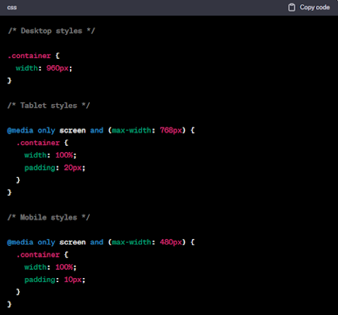
Use a responsive web design: A responsive design allows your
website to adapt and display properly on different devices and screen sizes. It
ensures that your website looks and functions well on desktops, tablets, and
mobile devices. Here's an example of responsive web design code using CSS media
queries:
In this example, the container element's width and padding
are adjusted based on the screen size.
Optimize images: Mobile devices typically have slower
internet connections compared to desktops. To ensure fast page load times,
optimize your images by compressing them without compromising quality. Here's
an example of optimizing an image using a tool like TinyPNG:
Before uploading the image to your website, you can use TinyPNG
(https://tinypng.com/) or other similar tools to reduce the image size while
maintaining the dimensions and quality.
Use mobile-friendly navigation: Simplify your website's
navigation for mobile devices. Utilize a responsive menu or hamburger menu icon
(three horizontal lines) that expands when clicked. This provides a
user-friendly experience on smaller screens. Here's an example of HTML and CSS
for a responsive menu:
In this example, the menu is hidden by default on larger
screens and appears as a hamburger icon on smaller screens. Clicking the icon
displays the menu options.
Ensure readability and touch-friendly elements: Make sure
your website's text is legible on mobile devices without users having to zoom
in. Use a font size that is easy to read and provide sufficient spacing between
clickable elements to prevent accidental taps. Here's an example of CSS to
ensure readability:
In this example, the body text has a font size of 16 pixels
with a line height of 1.5. Links and buttons have padding for touch-friendly
interaction.
Test and optimize performance: Regularly test your website's
performance on mobile devices using tools like Google PageSpeed Insights
(https://developers.google.com


